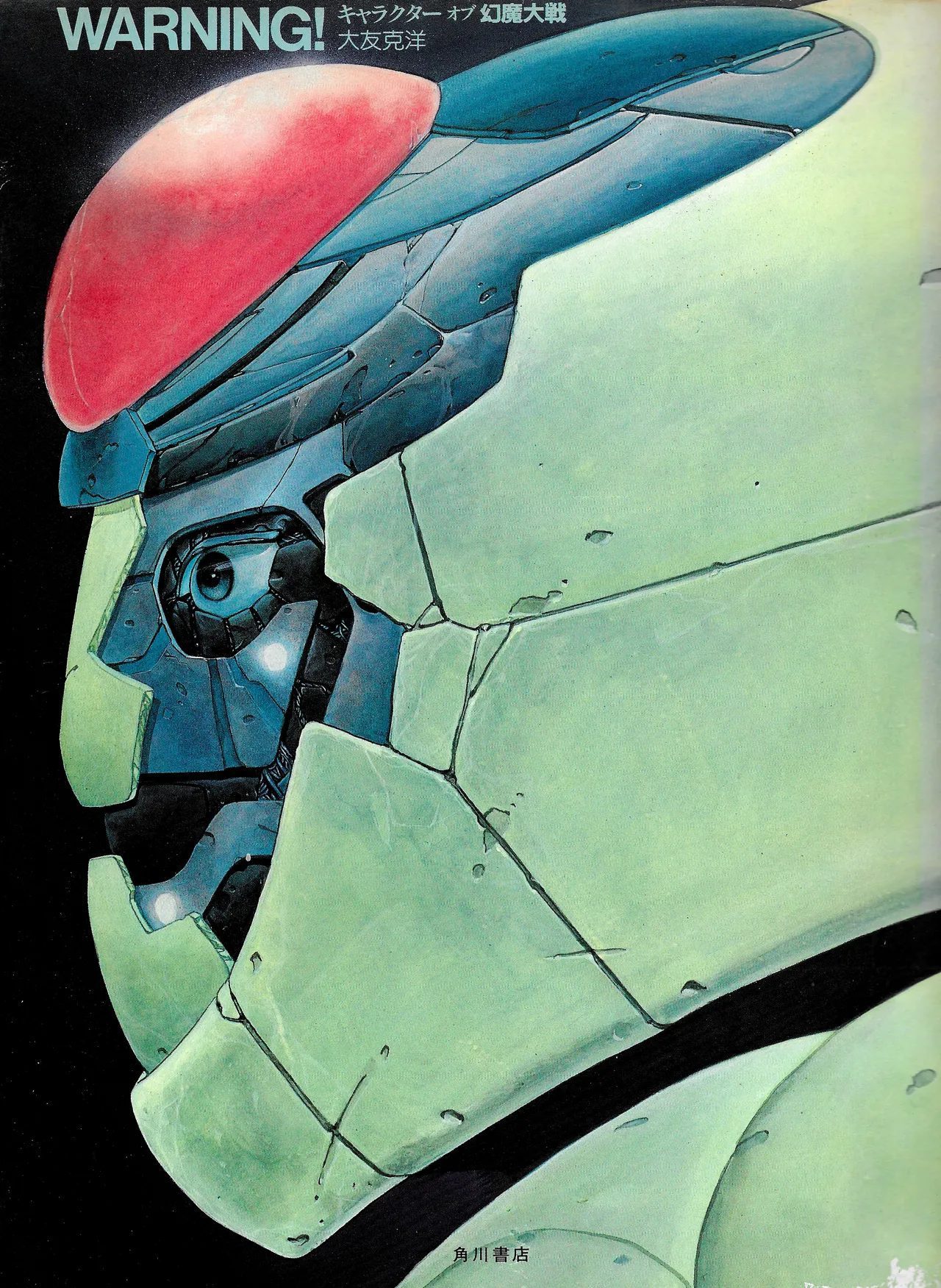
WARNING! キャラクター オブ 幻魔大戦 is 96 pages, published by Kadokawa Shoten in 1983. It is the first book Katsuhiro Otomo published under his own name. Before KABA (1988), before the Akira art books, before anything — this. A character design book for an anime film, assembled while the film was in production. Otomo was 30 years old.
The book documents his design work for Rintaro's film: the robot (Bega/Silicone, a mechanized alien ally), the psychic protagonist East Jo, the antagonist Genma entity, the full supporting cast of international psychics, and the villain creatures. It is organized by character section, each section distinguished by a color-coded background — pink, lavender, blue, green, cyan — that runs from the production's internal reference materials into the printed page. The layouts were designed. This is not a collection of loose sheets. It is a designed object.
Before Akira
The robot on this cover looks like Akira before Akira exists. The segmented armor, the realistic proportions, the surface weathering, the refusal to make the machine heroic — these are the design principles Otomo would apply to the Colonel's military hardware and the capsule bikes of Neo-Tokyo. Here they first appear in a film most Western audiences have never seen, made five years before Akira was released. The cover is a close-up of a single character's head. No logo at the top. No promotional copy. Publisher and title run in small type at the edge. The drawing is the cover's argument for itself.
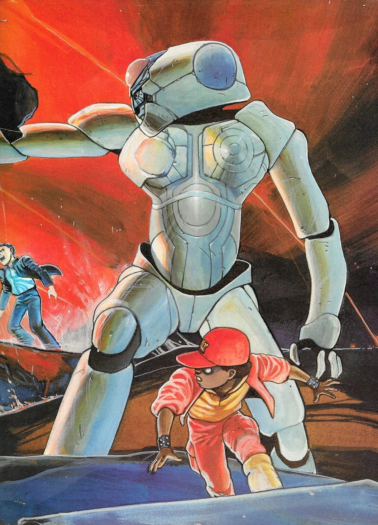 Full-color illustration — Bega/Silicone (the robot ally) at scale against a red sky, the child psychic Tao in the foreground. Otomo's robot design is resolutely industrial: articulated joints, modular armor sections, no organic flourishes. The child's proportions are specific and correct.
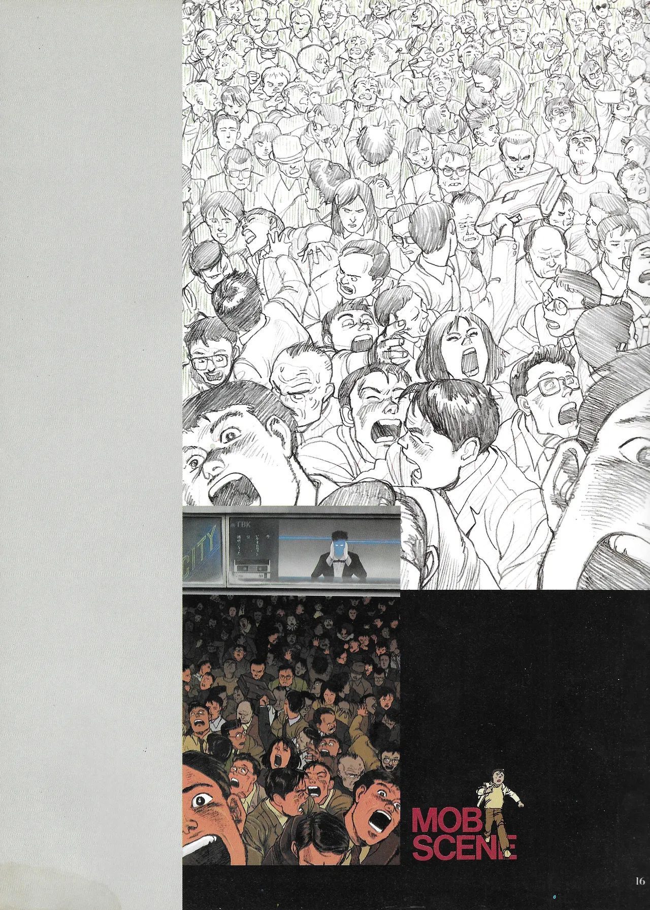 Mob scene study spread — Otomo's original manga crowd technique (top, ink on paper) beside the animation production version labeled "MOB SCENE" (bottom, with a lone figure standing in front). The gap between his comics draftsmanship and what animation could reproduce, made visible on a single page.
The Mob Scene Page
This is the most revealing page in the book. The top panel is Otomo's crowd technique: hundreds of individual faces drawn with full expression and personality, each one specific, the visual pressure of a packed public space rendered as draftsmanship. Below it, the animation production reference: the same crowd reduced to suggest-and-imply, a lone character standing before it. The gap between the two is not failure — it is the practical limit of cel animation's budget and labor. But placing them on the same page, without comment, lets you see exactly what translation costs. The crowd drawing at the top is what would become Neo-Tokyo. It was always in him.
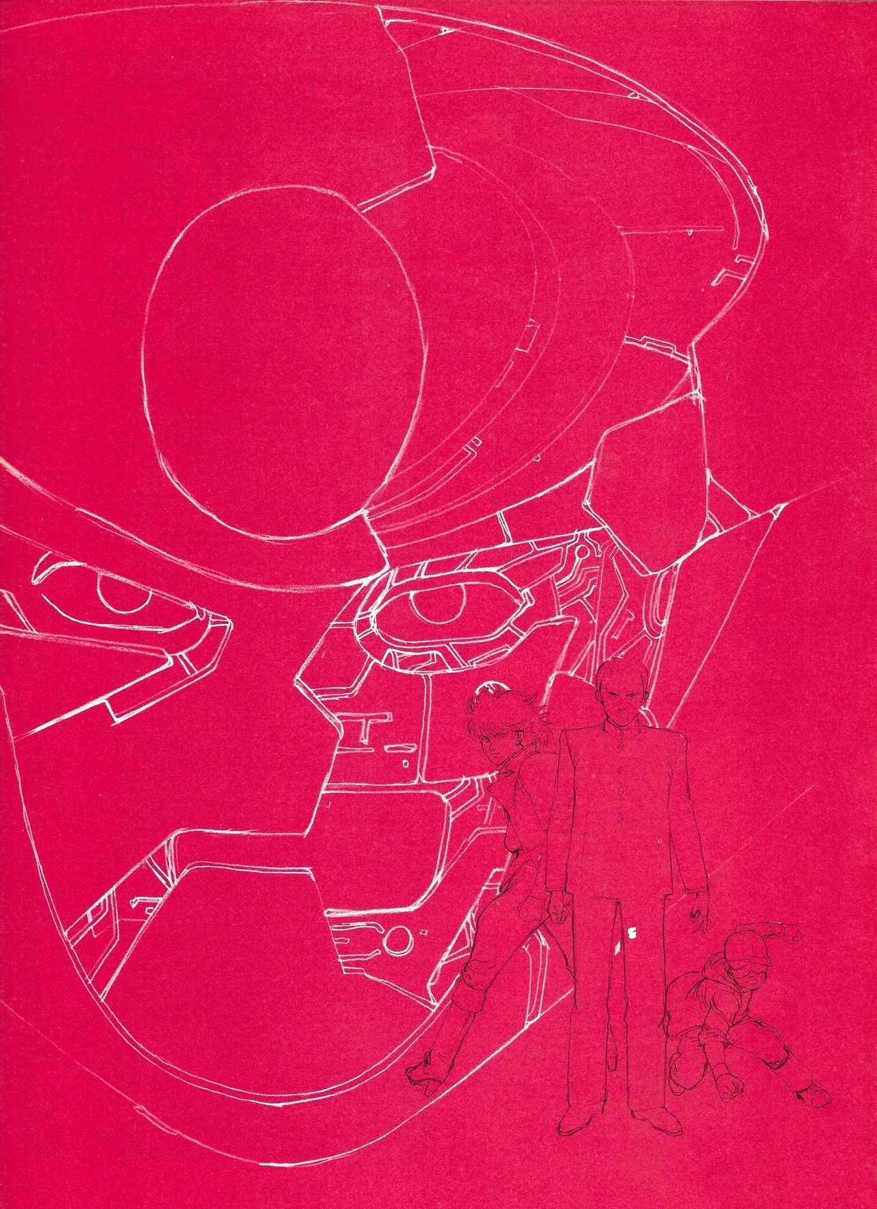 Design sketch page — white line on red ground. The robot in extreme close-up, with the male protagonist and a child figure in the lower right. The high-contrast color design (section divider art) appears throughout the book as a visual system linking sections.
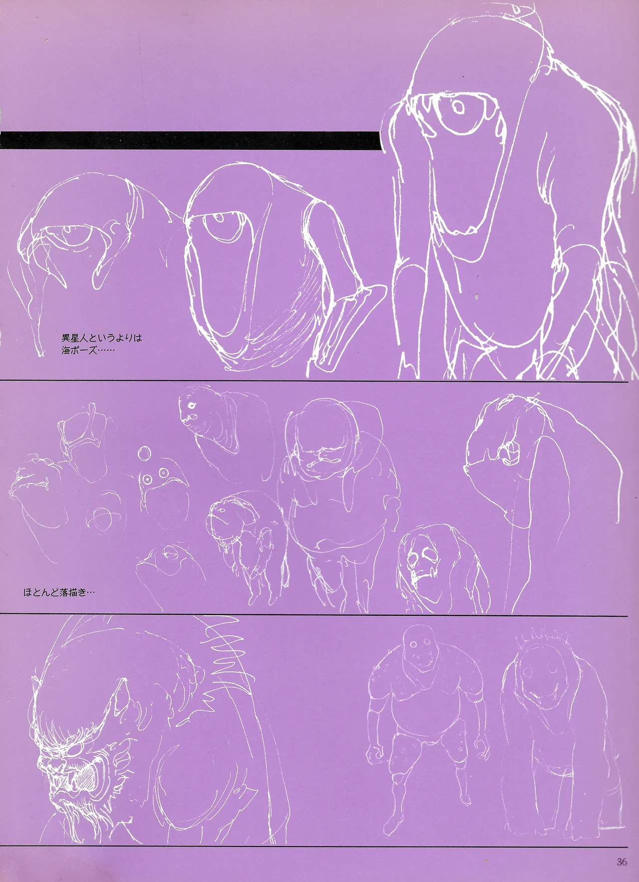 Villain settei — Zamedy, the antagonist creature. Five views (front, three-quarter, back, three-quarter back, side) in the upper register. Below: actor-scale encounter reference and a pink-ground concept sketch. Otomo approached the alien anatomy as a biological study, not a monster design.
The Villain Sheets
The villain design pages use the same methodology Otomo would apply to robots: rigorous multi-angle turnaround views, cross-sectional reasoning, proportional consistency across poses. Zamedy is drawn as if it were an organism that actually exists — front/side/back at consistent scale, with anatomical articulation that follows its own internal logic. The encounter reference drawing below shows a human-scale actor framing. The pink-ground concept sketch in the inset shows Otomo's rough massing before the clean-up. The book doesn't hide the process. It shows how a design was argued into existence.
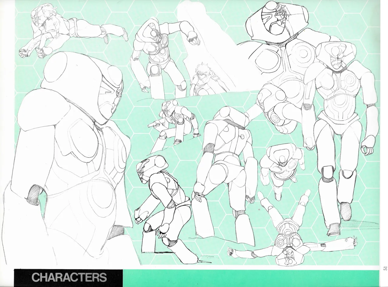 "CHARACTERS" section spread — robot Bega in multiple action poses on a green hexagonal-pattern ground. Upper register: full-body poses at varying scales. Lower register: additional action studies. The honeycomb background appears throughout the book's character sections, carried from the production's internal visual system.
Kadokawa Shoten published this in 1983. It came out, sold to the film's audience, and went out of print. Otomo went on to publish Akira in serial form beginning in 1982 (overlapping with this film's production), then KABA, then every artbook that followed. By the time those books arrived, WARNING! had become a footnote — the thing before the things that mattered.
It is not a footnote. It is the first documented evidence of how Otomo thinks about design: the rigor, the biological seriousness applied to alien anatomy, the refusal to stylize when anatomy will do, the crowd as an architectural problem. Everything in Akira was already present here, working itself out in a film most people have not seen.
Loading...