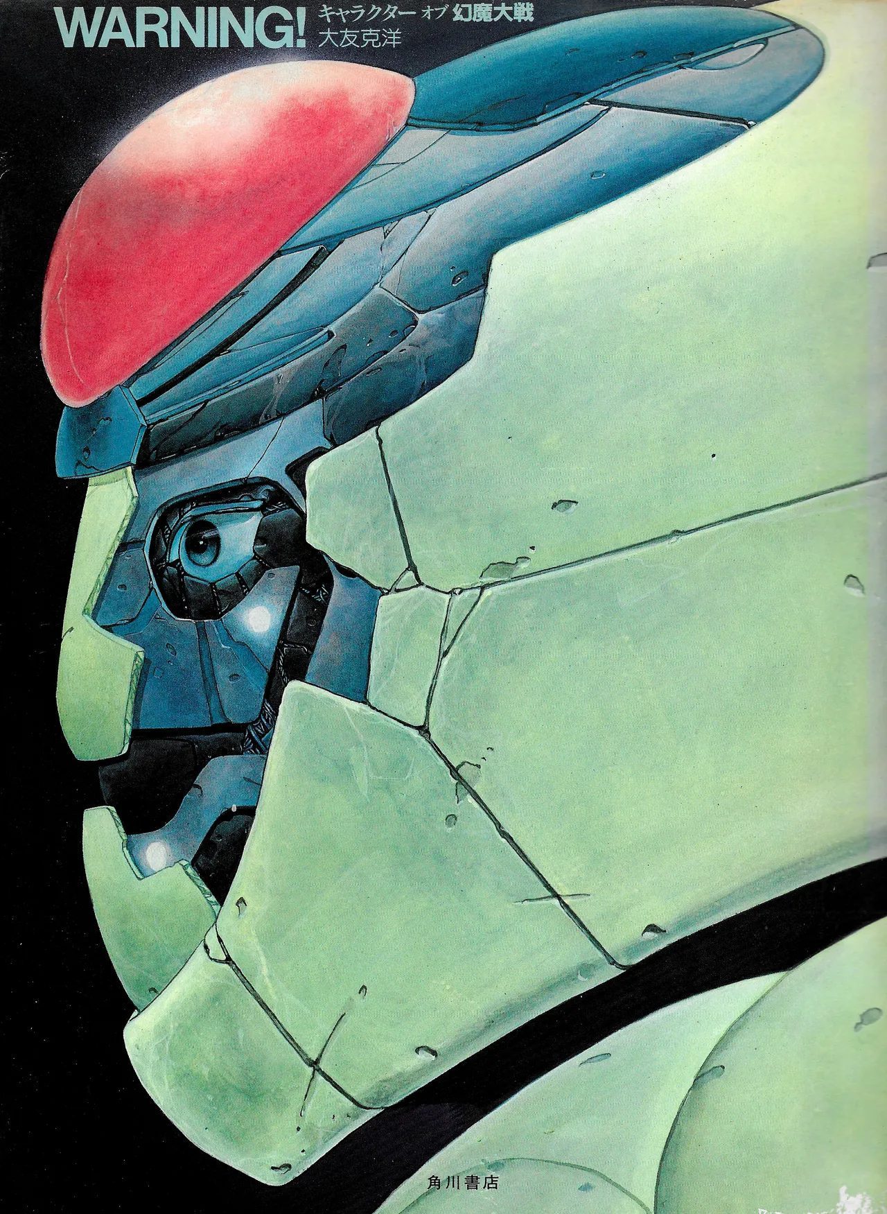
The Harmagedon design documents show Otomo's visual commitments in formation: the industrial-realist robot, the naturalistic protagonist, the crowd rendered as an architectural problem. These are not influences on Akira — they are Akira, five years early, working through a different story.
Rintaro described working with Otomo on specific costume details: whether East Jo should wear work boots or wingtips, what color sweater, whether to add a belt. This level of attention to a protagonist's ordinary clothes was not standard practice in 1983 anime production. Most character design negotiations ran at the level of silhouette and color scheme.
Otomo was working at the level of who a person actually is.
This is what makes the Harmagedon materials valuable independent of the film's reputation. The design documents — the settei sheets, the mob scene study, the image boards — show a specific way of thinking about visual truth: machinery that looks used, people that look real, crowds that have weight and individual faces. None of these commitments required Akira to be important. They were already operating here, at full intensity, in a film made when Otomo was 30 years old and largely unknown outside manga circles.
Akira arrived five years later and made the commitments famous. Harmagedon is where they were first applied to animation.
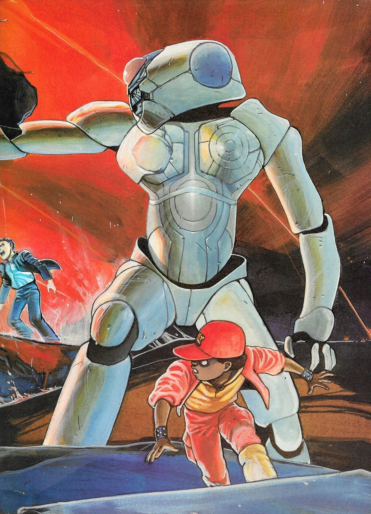
- The robot Bega: segmented armor, realistic joint articulation, surface weathering. No energy swords, no heroic silhouette. The same design philosophy that would produce the Colonel's mobile units and Kaneda's capsule bike. Rintaro and Otomo argued about specific costume details — work boots versus wingtips, sweater colors, belt choices. This level of specificity for a 1983 anime production was unusual, and the design documentation shows it.
- The crowd technique: the mob scene spread in WARNING! places Otomo's manga crowd drawing (hundreds of specific, individually-characterized faces) beside the animation production version (suggested, reduced). The manga drawing at the top is what Neo-Tokyo's crowds would look like. Otomo was already drawing that crowd, five years early, for a different film.
- The protagonist design: East Jo (東丈) wears a dark school uniform. No special outfit, no transformation sequence. A young man in ordinary clothes who happens to be a psychic. This refusal to costume the hero — to let the character's power exist in the performance rather than the silhouette — is the same choice Otomo made for Tetsuo and Kaneda. Regular clothes on people doing extraordinary things.
- The villain anatomy: the Zamedy creature is designed via multi-angle turnaround, the same methodology applied to a real organism. Front, side, back — proportional, internally consistent, biologically reasoned. The monster is not metaphorical. It has a body that obeys its own physics. This is what Otomo's biological engineering looks like before Tetsuo's mutation gave it a narrative home.
- WARNING! キャラクター オブ 幻魔大戦 — the design book (site card)
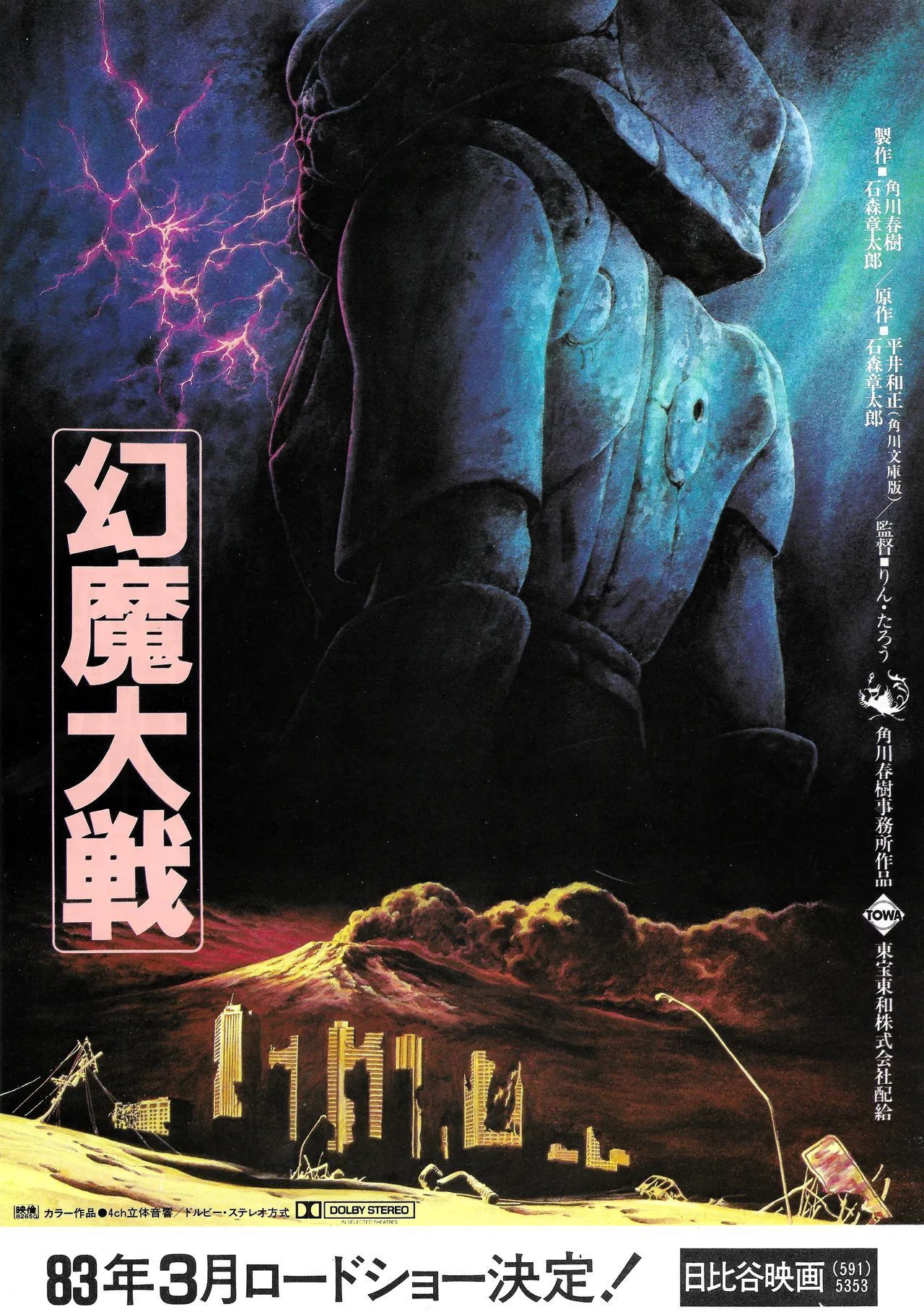
- The Harmagedon LaserDisc gatefold — where these drawings appear as packaging
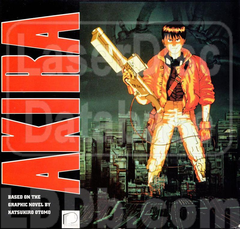
- Akira (1988) — where the visual language arrived at its full expression
Loading...